
You can spend good money on a logo and still end up with something that disappears on a shop fascia, prints muddy on leaflets, or looks cheap on a van. That’s not bad luck, it’s usually a handful of avoidable decisions made early on. In this guide, we’ll walk you through Logo Design Mistakes to Avoid so your brand stays clear, consistent, and recognisable wherever customers see it.
Key Takeaways
- Starting logo design without a clear brief and usage plan often leads to costly revisions and poor real-world performance.
- Avoid overcomplicating your logo; simplicity ensures clarity, recognisability, and reduces production costs.
- Choose a logo type that fits your business context and ensures legibility across all applications.
- Prioritise good typography—use readable, licensed fonts with proper spacing to maintain professionalism and consistency.
- Test colour choices for print and signage to prevent unexpected shifts and ensure consistency across different materials.
- Design logos to be scalable and legible at various sizes, creating variations for different uses to maintain brand impact.
- Consider production constraints early by requesting mock-ups for embroidery, vinyl cutting, and printing to avoid costly adjustments later.
- Steer clear of trendy templates or stock icons to maintain distinctiveness and customer recognition over time.
- Implement practical brand guidelines and consistent file management to protect brand integrity across all platforms and suppliers.
Starting Without A Clear Brief And Usage Plan
You wouldn’t order signage without measuring the wall, yet plenty of logos get designed without knowing where they need to work.
If you start without a brief and a usage plan, you force the designer (or your internal team) to guess. That guesswork shows up later as rushed changes, extra cost, and a logo that looks fine on-screen but fails the moment you apply it to a van, a uniform, or a shopfront.
A practical brief doesn’t need to be a 40-page brand manifesto. It needs specifics:
- Where the logo must appear in the real world: fascia signage, window vinyl, A5 leaflets, embroidered workwear, social headers.
- Primary viewing distance: 30cm (business card), 3m (reception sign), 30m (roadside sign).
- What you sell and who you sell to: “family-run MOT garage serving Royal Wootton Bassett” is more useful than “automotive services”.
- Competitor scan: list 5 local or sector competitors and note what their logos rely on (shields, swooshes, initials, etc.).
We find it helps to write a one-line outcome statement before any sketching: “People should recognise us instantly on signage and vehicles, and read the name at speed.” That single sentence stops a lot of the later back-and-forth.
If you need a reference point for what “brand identity” can look like when it’s treated as a system (not just a single mark), the portfolio example at https://asfcreative.co.uk/projects/identity-branding/ is the kind of joined-up thinking you want to aim for.
Overcomplicating The Mark (Too Many Details, Effects, Or Ideas)
The most common way a logo loses impact is by trying to say everything at once.
When you cram in fine lines, gradients, shadows, realistic icons, and three different “concepts” (location + service + heritage, for example), the mark becomes fragile. It might look impressive on a designer’s monitor, but it won’t hold up on a stitched polo, a small website header, or a one-colour stamp.
A simple test you can run before you sign anything off: the five-second recall test. Show the logo to someone for five seconds, hide it, and ask what they remember. If they say “it had… a circle… and maybe a building?” you’ve got a complexity problem. If they can describe a clear shape plus your name, you’re on the right track.
Here’s what “too complex” often looks like in real businesses:
- A restaurant logo that includes cutlery, a plate, steam, a tagline, and an illustrated building.
- A trades logo with a detailed mascot plus three service icons plus a phone number.
- A professional services logo with thin serif lettering, hairline rules, and a gradient that banded when printed.
What to do instead:
- Pick one main idea (speed, trust, craft, friendliness) and support it with typography.
- Reduce effects: flat colour generally reproduces more reliably across print, signage, and digital.
- Design for one colour first: if it works in black, it will usually work in colour.
This is one of the biggest Logo Design Mistakes to Avoid because complexity doesn’t just hurt aesthetics, it increases production cost. A logo that requires full colour, tight tolerances, or multiple materials can push up prices for signage, embroidery, and print finishes.

Choosing The Wrong Logo Type For Your Business And Context
You can choose a “good” logo style and still make the wrong choice for your context.
A logo type that suits a tech startup may not suit a local building supplier. A badge-style crest may look credible on a craft brewery, but it can become unreadable when you need it on a social avatar or a small product label.
Most logos fall into a few practical categories:
- Wordmark (name only): strong for clarity and search recognition, especially for local businesses.
- Lettermark (initials): useful for long names, but can feel generic if not crafted carefully.
- Symbol + wordmark: flexible if the symbol works alone at small sizes.
- Badge/emblem: can signal heritage, but often struggles with legibility.
To choose well, match the type to how customers meet you:
- If people see you at speed (vehicles, roadside signage), prioritise a bold wordmark and a simple icon.
- If your name is your advantage (family name, local reputation), don’t hide it behind a symbol.
- If you need product marking (labels, small packaging), avoid emblem logos packed with tiny details.
A common real-world mismatch: a new business chooses an abstract symbol because it feels “premium”, but customers then can’t remember or spell the name. You end up paying twice, once for the logo, again for extra signage, bigger text, or additional messaging to compensate.
If you want to see how branding can translate across different outputs (not just a logo on a white background), browse a broader branding execution example like https://asfcreative.co.uk/projects/branding/. The useful takeaway is not the style, it’s the way the identity has to hold together across applications.
Poor Typography Choices And Bad Font Handling
Typography is where “looks fine” turns into “looks amateur” very quickly.
If you pick a trendy font, stretch it, add odd spacing, or mix multiple typefaces, your logo becomes hard to read and difficult to reproduce consistently. And because typography carries personality, the wrong choice can send the wrong message, playful when you need dependable, or luxury when you need approachable.
Watch for these avoidable issues:
- Too many fonts: one family (with weights) is usually enough.
- Poor kerning (spacing between letters): common in DIY logos, and painfully obvious on signage.
- Thin strokes: they break up in embroidery and disappear at distance.
- Default fonts: they can look generic, and your competitors may already use something similar.
A practical way to check typography fast: print the logo on A4, tape it to a wall, and stand 3–5 metres back. If you can’t read the name instantly, your type is too thin, too condensed, or too clever.
Also think about licensing. If you use a font without the right commercial licence, you can create a legal and operational mess later when another supplier needs the files. Ask for the font name, licence type, and a fallback option.
We recommend you request outlined type in the final master files (so the logo doesn’t rely on the font being installed), plus a version where the font remains live for future brand materials like brochures and ads. That one decision can save hours when you need quick updates for print or campaign work.
Colour Missteps That Break In Print And Signage
Colour problems often don’t show up until you’ve paid for production.
On-screen, almost any colour looks bright and clean. In print, colours can shift. On signage, lighting conditions change everything. On vehicles, your “deep black” might look washed out next to paintwork. If you don’t plan for those realities, you get inconsistency, and inconsistency kills recognition.
The biggest colour traps to avoid:
- Designing only in RGB: you need CMYK equivalents for print, and sometimes spot colours for consistency.
- Using too many colours: four or five might look “fun” but can become a mess on busy backgrounds.
- Ignoring contrast: pale colours on white vans or light shopfronts reduce legibility.
- No black-and-white version: you will need it for stamps, single-colour print, engraving, or low-cost runs.
A simple process that works:
- Start with a one-colour logo (black). Confirm it reads well.
- Choose one primary brand colour and one supporting colour.
- Define values: HEX (digital), CMYK (print), and Pantone (when consistency matters).
- Test on real backgrounds you actually use: white vehicles, dark fascia panels, window glass, kraft packaging.
For physical visibility businesses, colour also affects materials and cost. An illuminated sign face, for example, may render colours differently once backlit, and some vinyl colours behave differently outdoors.
If signage is a key channel for you, it’s worth looking at real fabricated examples such as https://asfcreative.co.uk/projects/retail-shop-branded-fascia/ to remind yourself that “logo colour” isn’t abstract, it’s a decision that has to survive daylight, shadows, and reflections.
Ignoring Scalability And Legibility Across Sizes
A logo that only works at one size isn’t a logo you can actually use.
In the real world, your mark has to perform at tiny sizes (social profile icon, email signature, promo pen) and huge sizes (shop fascia, pull-up banner, poster). If you ignore scalability, you end up with a logo that needs constant redraws, alternative versions made in a rush, and inconsistent use across teams.
Run these checks before you approve the final design:
- Small-size test: shrink the logo to 24px height (typical favicon/social use). Can you still identify it?
- Business card test: print it at 20–25mm wide. Does the name stay readable?
- Distance test: view it from 5–10 metres. Do the main shapes hold?
If your logo fails at small sizes, the culprit is usually one of these:
- Fine linework or thin type
- Long taglines forced into the lock-up
- A complex symbol that relies on internal detail
The fix is not “make it bigger everywhere” (you can’t). The fix is to design a logo system:
- A primary logo (full lock-up)
- A simplified small-size version (often icon + short name or initials)
- A one-colour version
This approach also helps marketing. When you run a campaign, you can keep the brand consistent without squeezing the full logo into spaces where it doesn’t fit.
If you want a practical example of designing for different sizes and formats, look at a multi-format output like https://asfcreative.co.uk/projects/a1-advertising-posters/. Posters are unforgiving: you need impact at distance and clarity up close, which is exactly the scalability problem in a nutshell.
Failing To Design For Real-World Production Constraints
Production constraints are where good-looking logos go to die.
If you don’t consider how the logo will be made, you can end up with something that is technically “designed” but practically impossible, painfully expensive, or inconsistent across suppliers. This hits hardest for businesses that rely on physical visibility: signage, vehicles, uniforms, printed stationery, and merchandise.
Common constraint issues we see:
- Embroidery limits: very small text, fine lines, and tight gaps fill in when stitched.
- Vinyl cutting limits: thin strokes and tiny counters (like inside an “e”) can tear or lift.
- Large-format print realities: gradients can band, and low-resolution logos look soft.
- Material interactions: glossy acrylic, matt vinyl, and textured walls all affect perceived colour and edge sharpness.
A practical way to avoid late-stage surprises is to ask for “production proofs” early:
- A one-colour cut-vinyl mock-up
- A basic embroidery simulation at the actual chest size (not scaled up on screen)
- A print proof on the paper stock you’ll use for leaflets or business cards
You don’t need to physically manufacture everything before launch, but you do need to design with the constraints in mind. It’s cheaper to adjust a stroke width in the design stage than to remake a batch of workwear.
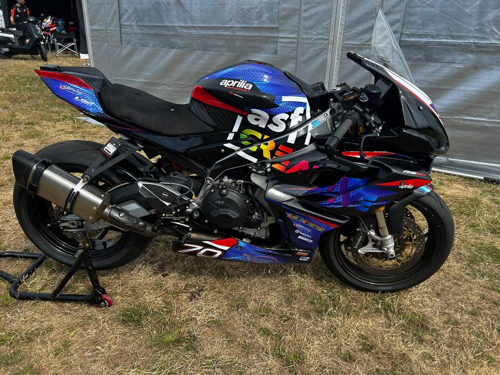
For a grounded example, vehicle branding is a perfect stress test because it mixes distance viewing, curved surfaces, and outdoor conditions. Work like https://asfcreative.co.uk/projects/vinyl-van-signage/ shows why strong, simple shapes and clear typography tend to win on the road.
Relying On Trends, Templates, Or Stock Icons (And Losing Distinctiveness)
If your logo looks like ten others in your area, you’ve paid for camouflage.
Trends move fast, but signage, vans, uniforms, and printed materials stay in the world for years. When you rely on templates or stock icons, you risk two very practical problems: customers don’t remember you, and your brand becomes hard to defend if someone else uses something similar.
Trend traps that date quickly:
- Ultra-thin sans serif wordmarks that vanish at distance
- Overused “abstract swoosh” icons
- Generic badges with established-year text when you’re a new business
- Gradient-heavy marks that look different on every screen and printer
A simple distinctiveness check you can do in an hour:
- Screenshot 20 competitor logos from your local area or sector.
- Put them in a grid next to yours.
- Ask: would a customer recognise you from 3 seconds of exposure?
If your icon is a common symbol (a house for property services, a spanner for mechanics), you don’t have to abandon it, but you do need to make it yours through a unique shape language, a custom illustration style, or distinctive typography.
We also see problems when businesses choose a logo based on what “looks modern” on Instagram, then discover it doesn’t suit their real-world customer base. If your customers value trust and clarity, a fashionable mark can quietly undermine confidence.
One of the most expensive Logo Design Mistakes to Avoid is launching a logo that you later have to replace because it already feels dated, or because you realise you can’t stand out in a crowded high street.
Skipping Brand Consistency And Practical Guidelines
A logo on its own doesn’t protect your brand, consistent use does.
If different people use different files, colours, and layouts, your brand starts to “wobble”. Customers notice it even if they can’t describe it. One flyer looks like one business, the van looks like another, and the shop signage looks like a third. That inconsistency reduces trust, and it makes your marketing less efficient because repetition is what builds recognition.
You don’t need a huge brand book. You need a one-page practical guide that answers real questions your team and suppliers will ask:
- Which logo version is the default?
- What is the minimum size for print and for digital?
- What are the exact colour values (HEX/CMYK/Pantone where relevant)?
- What background colours are allowed (and which are not)?
- What clear space rules stop the logo being crowded by other elements?
- Which file formats should be used for which jobs (SVG/PDF/EPS for print, PNG for digital)?
Then, store the files somewhere obvious with clear naming. “Final_logo2_revised_NEW.png” is a guarantee that someone will use the wrong version on a paid print run.
We recommend you build a small “starter kit” folder:
- /Master (vector files)
- /Print (PDF, CMYK)
- /Digital (SVG, PNG, RGB)
- /Social (profile and header crops)
If you work with multiple suppliers, this becomes even more important. It keeps your print, signage, and online assets aligned without constant supervision from you.
Conclusion
Most logo problems are not “design taste” issues, they’re practical visibility issues that show up in print, on signage, on vehicles, and in day-to-day marketing. If you take one thing from this list of Logo Design Mistakes to Avoid, let it be this: plan the real-world usage first, then design for clarity, reproducibility, and consistency.
If you want a safer path, treat your logo as a small system (versions, colours, files, rules) and test it in the formats you actually pay for. That’s how you get a mark that doesn’t just look good in a PDF, but works hard for your brand in 2026 and beyond.
Common Questions About Logo Design Mistakes to Avoid
What is the most important first step to avoid logo design mistakes?
Starting with a clear brief and usage plan is critical. Knowing where your logo will appear, who your customers are, and what competitors do helps create a focused and effective logo that works across real-world applications.
Why should I avoid overcomplicating my logo design?
Overly detailed logos with many effects or concepts lose impact and readability. Simple logos reproduce better on signage, uniforms, and small print while reducing production costs, ensuring your brand stays clear and recognisable.
How can I choose the right type of logo for my business?
Select a logo style that fits your business context and customer interaction. For example, bold wordmarks suit fast-moving visibility like vehicles, while product labels benefit from simple icons rather than busy emblems.
What typography mistakes should I avoid in logo design?
Avoid using too many fonts, poor letter spacing, thin strokes, or default fonts. Typography should be clear, readable from a distance, and match your brand personality to maintain professionalism and legibility across media.
How do colour choices affect logo performance in print and signage?
Choosing colours only in RGB can cause inconsistency when printed or displayed on different materials. Test logo colours in CMYK, spot colours, and black-and-white versions to ensure legibility and brand consistency across all physical applications.
Can ASF Creative help if I only have a rough idea for my logo?
Yes. ASF Creative offers a consultative, flexible process that helps turn your initial ideas into practical, high-impact logos suited for production and real-world use, supporting you from concept through to delivery.