I believe that experience is as valuable, if not more than theory. I’ve always been a practical person, gaining more knowledge from doing, than learning from a book. I spent three years as an apprentice printer, going to college whilst also working on the presses. For me, the first two years was just confirming what I was physically doing day to day, it was only during the last year that I had to knuckle down to gain distinctions in 7 of 9 City & Guilds reprographics categories. Print finishing, screen printing, digital printing and production management has been the progression of my career since, and my understanding of many production processes has been key to the latter roles, allowing me to confidently offer key advice to my designer peers. Once I was told by a senior creative “You inhibit my creativity!” which doesn’t sound very good does it? However, as the production manager of a large agency at the time, I was able to reply, “If I am, it’s because we need to deliver the job on time and on budget!”
I still work closely with him today, and he’s a fantastic designer, but he will admit even now, he lacks knowledge of production processes, and that’s where my complementary knowledge and experience has been key over the years for designers. Which drives me back to the title of this feature…
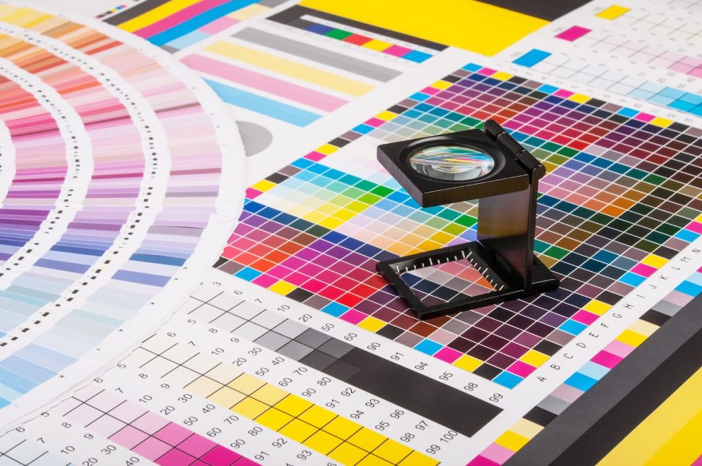
As most of you will know, to print a full colour image on paper like this page, we use the 4 colour printing process; Cyan, Magenta, Yellow and blacK (CMYK). So when you print black at 100% you would expect to get a true solid black wouldn’t you? Well no, thats not necessarily the outcome that could be achieved. The 4 colour process inks are transparent, they work together and overlay each other at different angles in order to achieve the wide range of colours the printing process can achieve.
 But if you print 100% black on an uncoated stock, the already transparent black ink will be absorbed into the paper and will look very grey. On a silk or gloss coated stock there is less absorption due to the surface coating so will look more acceptable, but it will still not be a strong rich black. However, take the same artwork and print it digitally using a dry toner based printer, and there is no absorption, the toner sits on top of the paper and will look really strong.
The point is that you need to adjust artwork in accordance to the printing process, paper stock being used and desired result. This is one of many things that should be considered when designing for print, but you would be surprised at how many people creating such material, do not have this understanding.
This is where Studio Creative Services excels. We understand the specifications of the job, the process that will be used and the desired result. We are looking to share our expertise with new clients, creating artwork in-house or working alongside existing creative teams, helping and advising the best way to create and produce marketing materials, whatever they might be. It’s not just the density of black ink we can advise on, we can provide advice in many areas: design, print production, large format print, signage, exhibitions, merchandise and more. So it could be a suggestion to reduce the page size of a magazine or brochure, to make more efficient use of the paper and the press, which could lead to savings of hundreds or even thousands of pounds. Or perhaps it could be branded merchandise – selected and produced in such a way it complements your existing material whilst creating the biggest impact to your marketing campaign. Whatever the requirement, we take great pride in everything we do, only offering products that we would be happy putting our own name on. If you like what you hear, please get in touch to discuss your next project with us.