


You can spend thousands on a stand and still watch people walk past because they can’t tell what you do in five seconds. A flyer should fix that, but only if it earns its place in someone’s hand (and in their bag) instead of going straight into the nearest bin. In this guide to Designing Flyers for Trade Shows, we’ll show you how to plan, write, design and print a flyer that supports real conversations and measurable follow-up. We’ll share the practical choices we see working on busy UK show floors, from format and hierarchy to print finishes and lead capture.
Key Takeaways
- Designing flyers for trade shows starts with a clear goal and target audience focused on one primary action to maximise impact.
- Choose flyer formats and paper weights that suit your stand interaction and offer type, favouring durability and clarity over quantity of content.
- Write benefit-led, easy-to-scan copy with clear headlines, proof points, and a single, strong call to action to engage busy trade show visitors.
- Develop a visual hierarchy with one focal point, consistent branding, and real imagery to ensure your flyers stand out and support your brand identity.
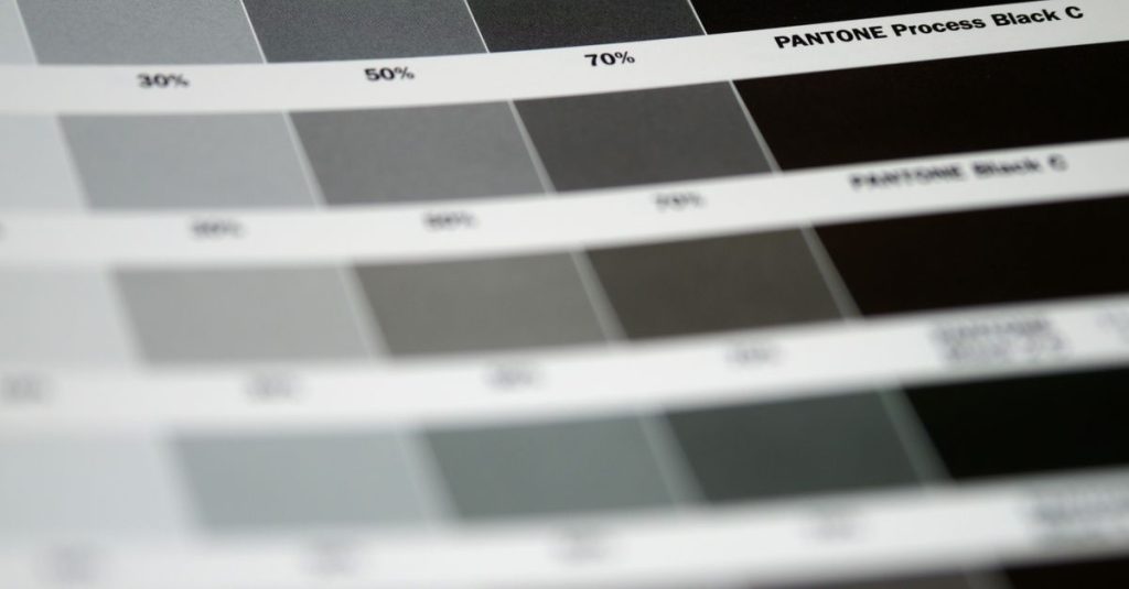
- Prepare your flyers print-ready by using CMYK colours, high-resolution images, appropriate bleed, and consider finishes like matt lamination for a premium feel.
- Plan flyer distribution strategically with confident staff, clear handover scripts, and integrated lead capture via QR codes or show codes to convert interest into measurable follow-ups.
Set A Clear Goal And Define Who You’re Targeting On The Show Floor
You don’t lose leads at trade shows because your flyer looks “bad”. You lose them because the flyer tries to do everything at once, sell, explain, educate, impress, and ends up saying nothing clearly.
Start by picking one primary goal for the flyer, based on what you actually need from the event:
- Book meetings (best for high-value B2B services): one strong offer, a simple booking route, and 2–3 proof points.
- Collect qualified leads (best for mid-ticket products): a clear reason to share details (guide, sample, discount, audit).
- Drive to a specific action (best for product launches): “See the demo at stand B12 at 11:30” or “Scan to compare models”.
- Support stand conversations (best for complex solutions): a short “what we do” plus a takeaway checklist.
Then define who you’re targeting on the show floor, not in a boardroom. At most events, you’ll meet at least three different mindsets:
- The buyer (cares about outcomes and budget): lead with results, timelines, and pricing approach.
- The user (cares about day-to-day pain): lead with “makes X easier” and practical features.
- The influencer (cares about risk and reputation): lead with compliance, reliability, and proof.
A simple way to keep the message tight is to write a one-line brief you can pin above your screen:
“This flyer is for [job role] who is struggling with [pain] and needs [outcome], so they [next action].”
If your brand story is inconsistent across print, stand graphics, and sales decks, fix that first, trade show visitors spot mixed messaging instantly. A quick look at your core identity elements (logo use, colours, tone of voice) will stop the flyer fighting your wider brand: the approach in projects like identity and branding work shows how a clear system makes every piece of collateral easier to recognise.
Before you move on, stress-test your goal with one question: “If someone only reads the headline and the call to action, do we still win?” If the answer is no, the goal isn’t clear enough yet.
Choose The Right Flyer Format For Your Booth And Offer
At a trade show, your flyer competes with free coffee, lanyards, and ten other leaflets already in someone’s tote bag. If the format is awkward, flimsy, or too dense, it won’t survive the first lap of the hall.
Match the format to how people will actually interact with it at your stand:
- Quick hand-out at the aisle: go smaller and punchier (DL or A6) so it’s easy to hold while walking.
- In-stand conversation support: use A5 or a folded DL so you can point to sections as you talk.
- High-consideration purchase (software, equipment, services): consider a fold with panels so you can layer the story (problem → solution → proof → next step).
- Multiple offers (ranges, packages, locations): consider a mini range card plus one deeper “hero” flyer rather than cramming everything onto one sheet.
Think about where it will sit as well. A deep stack of A4 sheets on a narrow counter looks messy within an hour. A neat DL holder or an A5 stack on a clean plinth keeps the stand looking sharp and makes it easier for staff to keep it topped up.
Flyer Sizes, Paper Options, And When Folds Make Sense
A common mistake is choosing paper after the design is finished. Paper weight and finish change how colours look, how premium the piece feels, and whether it stays flat or curls.
Here’s a practical starting point for trade show flyers:
- DL (99 × 210mm): great for a single, focused message and a clear CTA (scan, book, claim). Works well in holders and pockets.
- A5 (148 × 210mm): the best “all-rounder” for short explanations, feature lists, and a few proof points.
- A4: only worth it if you genuinely need space (technical specs, diagrams). Otherwise it’s heavy and gets folded badly.
For stock, aim for 170gsm–350gsm depending on intent:
- 170–200gsm silk: cost-effective for volume hand-outs: still feels decent.
- 250–350gsm silk or matt: better for premium positioning or when you want it to last until the visitor gets back to the office.
Folds make sense when you need structure. A tri-fold can give you a natural sequence: panel 1 headline, panel 2 problem, panel 3 solution, panel 4 proof, panel 5 offer, panel 6 CTA. The key is to design to the fold, not force content into it.
If you want a benchmark for common show-friendly formats, the portfolio examples for DL leaflet design and print and A5 product leaflets are good references for how much content realistically fits without turning into a wall of text.
Write Benefit-Led Copy That’s Easy To Scan In Seconds
If your flyer needs “a quick read”, it’s already too slow. On a busy stand, people scan first, decide second, and only read properly if you’ve earned it.
Write for scanning by building the copy in layers:
- Headline: one clear outcome (not a slogan). Example: “Cut packaging waste by 30% with returnable crates.”
- Subhead: who it’s for + when it helps. Example: “For food manufacturers shipping nationwide.”
- Three proof-led bullets: benefits with specifics. Example: “Hygienic, stackable, UK stock, 5-day delivery.”
- One short paragraph: what the visitor gets next (demo, quote, sample, audit).
- CTA: one action, one route.
A quick copy trick we use is to replace vague claims with numbers or conditions:
- Instead of “fast turnaround”, write “artwork approved by 2pm prints same week”.
- Instead of “high quality”, write “350gsm silk with matt lamination”.
- Instead of “trusted by many”, write “supplying 200+ sites” (only if it’s true).
Also, keep your sentences short and literal. Trade show visitors won’t decode clever phrasing while juggling coffee and a badge.
What To Include On A Trade Show Flyer (And What To Leave Out)
When space is tight, deciding what to remove is the real skill. Use this as your “must-have / nice-to-have / remove” filter.
Include (almost always):
- A clear offer or outcome: “Book a 15-minute stand demo” or “Get a sample pack”.
- What you do in plain language: “We design and print retail point-of-sale kits” beats “integrated solutions”.
- Who it’s for: industries, site types, or roles (e.g., “facilities managers”, “multi-site retail”).
- 2–4 proof points: accreditations, years trading, turnaround, UK manufacture, guarantees.
- One CTA: scan, email, call, book, pick one priority.
Leave out (unless essential):
- A full company history (move it to your website).
- Every service you offer (keep to the show’s context).
- Tiny social icons with no reason to follow.
- A long product catalogue in 6pt type.
If you need to support follow-up without cramming content onto the page, you can direct people to a specific landing page or downloadable guide. For businesses that also use printed updates or customer comms, a structured approach like a newsletter design and print project shows how to organise information so it stays readable and action-focused.
Finally, read your draft out loud to a colleague in 20 seconds. If you run out of breath before you reach the CTA, the visitor will run out of patience sooner.
Build A Layout With Strong Visual Hierarchy And One Focal Point
You can spot a weak trade show flyer from two metres away: everything is the same size, every corner has something in it, and your eye doesn’t know where to land. That’s not a design preference, it’s a conversion problem.
Build the layout around one focal point. Choose what you want noticed first, then design everything else to support it. For most trade show flyers, the focal point should be one of these:
- A strong headline with a clear outcome
- A single product image that shows the benefit
- A bold offer (demo, trial, show-only package)
From there, use a simple hierarchy that works even when someone is walking:
- Top third: headline + short subhead (your “grab”).
- Middle: 3–5 bullets or a short benefits list (your “proof”).
- Bottom: CTA + contact/QR + any compliance details (your “next step”).
Practical layout rules that consistently help on show floors:
- Use one grid (two columns or three zones). If you freestyle, the flyer will look chaotic.
- Keep body text at 10–12pt for A5 and 9–11pt for DL, depending on the font. If you have to go smaller, you have too much copy.
- Leave real white space. As a rough check, aim for 20–30% of the page to be breathing room.
- Align everything. Misaligned bullets and floating icons make even premium brands look rushed.
If you’re trying to include a process, turn it into a visual: “1. Survey 2. Design 3. Print 4. Install” with small icons works far better than a paragraph.
And don’t ignore the “table test”. Put your flyer on a cluttered table next to other leaflets. Step back. If your headline doesn’t stand out immediately, increase contrast, simplify the top section, or reduce competing elements.
The goal is not to impress designers. The goal is to make it obvious, fast, what you do and what someone should do next.
Make Branding, Imagery, And Proof Points Do The Heavy Lifting
When the hall is noisy and your team is mid-conversation, your flyer becomes your stand-in salesperson. If the branding is inconsistent or the imagery looks like a stock photo everyone has seen, the flyer quietly signals “generic” even if your offer isn’t.
Start with brand recognition. You want someone to spot your flyer later in their bag and instantly remember which stand you were. Do that with:
- Consistent logo placement (same corner, same clear space)
- One primary brand colour used with restraint (headline bar, CTA button, or key highlight)
- A font pairing you already use elsewhere (don’t introduce three new typefaces just for the show)
Then choose imagery that proves reality. For trade show flyers, the most effective images usually fall into one of these categories:
- Product in use: shows scale, context, and outcomes (e.g., signage installed on a real site, not a cut-out).
- Before and after: makes the benefit visible in one glance.
- Close-up detail: useful when quality matters (materials, finishes, build).
Proof points should be specific and easy to verify. Good examples include:
- “30+ years of print and production experience” (if accurate)
- “UK-wide delivery available”
- “Site survey visuals provided before production” (if that’s part of your process)
- Short testimonials (one sentence, attributed to a role or company type)
If your brand is due a tidy-up, do it before you design trade show collateral. Even simple consistency changes can lift trust quickly, as you can see in examples of perfect branding design projects where a clear system makes every asset feel like it belongs to the same company.
One more practical tip: add a tiny “memory hook” that sales teams can reference. For example, a named package (“The 5-Day Refresh Kit”) or a visual icon for your process. That small anchor makes follow-up calls smoother because both sides remember the same thing.
Get It Print-Ready: Colour, Resolution, Bleed, And Finishes
Nothing stings like opening a box of flyers the day before a show and realising the blacks look grey, the logo is slightly fuzzy, or the text sits too close to the edge. Print mistakes are expensive because they hit you twice: you pay for the reprint, and you lose momentum at the event.
Get the technical basics right early:
- Colour mode: design in CMYK, not RGB. RGB colours can shift when printed, especially bright greens and blues.
- Resolution: use images at 300dpi at final size. A web image stretched to A5 will look soft.
- Bleed: set 3mm bleed on all edges for standard print, and keep important text at least 5mm inside the trim.
- Black text: keep small text as 100% K (black) rather than rich black to avoid registration blur.
Finishes matter more at trade shows because you’re asking someone to keep the flyer.
- Matt lamination feels premium and reduces glare under harsh exhibition lighting.
- Silk is a reliable mid-point: good colour, good value, and still professional.
- Spot UV can highlight a headline or logo, but only if the rest of the design is clean enough to support it.
If you’re handing out thousands, spend the budget where it changes behaviour: better paper weight and a clearer design beat fancy finishes on a cluttered layout.
Print File And Pre-Press Checklist To Avoid Costly Reprints
Use this checklist before you send anything to print (or before you approve a proof):
- [ ] Correct final size set (DL/A5/A4) with 3mm bleed
- [ ] All text and logos inside a safe margin (at least 5mm)
- [ ] Images are 300dpi at the size they appear
- [ ] Colours set to CMYK and brand colours checked on a printed proof if critical
- [ ] Fonts embedded or outlined (to avoid substitutions)
- [ ] QR code tested on at least two phones and links to the right page
- [ ] Contact details checked by someone who didn’t write the flyer (fresh eyes catch errors)
- [ ] Any special finishes clearly marked (separate layer/artwork where required)
If you want a real-world example of how finishes change perception, look at print pieces that use tactile detail like 3D spot UV business cards, the same principles apply to flyers when you use finishing as an accent, not a distraction.
Finally, build time for one physical proof when the show matters. Screens lie. Lighting at exhibitions is unforgiving. A proof saves you from a box of regret.
Plan Distribution, Lead Capture, And Post-Show Follow-Up (So Flyers Don’t Get Binned)
The harsh truth is that most flyers don’t fail at design, they fail at the moment of handover. If you give someone a leaflet with no reason to keep it, they will bin it within 20 metres, usually near the first free pen.
Plan distribution like a process, not an afterthought:
- Decide who hands them out: your best “flyer people” are confident, friendly staff who can qualify in one sentence.
- Use a one-line handover script: “This is our 5-step site signage checklist, scan the QR for a quote template.” A specific value beats “Here you go”.
- Place flyers where people pause: demo stations, seating areas, meeting tables. A stack at the aisle invites grab-and-go browsing with zero context.
Then connect the flyer to lead capture. Three practical approaches work well in 2026:
- QR to a show landing page with one form field you actually need (name + email is often enough). Offer something relevant: a spec sheet, a pricing guide, a site survey checklist, or a booked slot.
- Show code printed on the flyer (e.g., EXPO26) so you can track responses and measure ROI.
- Conversation-driven capture: the flyer supports the chat, and your team logs notes in your CRM immediately after.
Make follow-up easy for you and relevant for them:
- Send a same-day email: “Great to meet you at Stand B12, here’s the PDF and the promised pricing guide.”
- Reference what they cared about: “You mentioned lead times for multi-site rollouts, here are our typical production windows.”
- Use a photo to jog memory: include a stand shot or the exact flyer cover.
Also consider the wider stand ecosystem. Flyers work better when they match your on-stand messaging and supporting graphics. If you’re updating the full set, examples like pull-up systems working together show how consistent headlines and visuals reinforce recall across different touchpoints.
To finish strong, set one internal rule for your team: no flyer leaves your stand without a next step, a scan, a booked time, a sample request, or at least a named contact. That’s how a simple printed sheet turns into a lead you can actually follow up.
Trade Show Flyer Design FAQs
What is the most important goal when designing flyers for trade shows?
The key to effective trade show flyers is to set a single clear goal that matches your event needs, such as booking meetings, collecting qualified leads, driving specific actions, or supporting stand conversations, ensuring your flyer speaks directly to your target audience on the show floor.
How should I choose the right flyer format for a trade show?
Select a flyer format based on how attendees will interact with it—small formats like DL or A6 for quick handouts, A5 or folded flyers for in-depth conversations, and multi-panel folds for detailed stories. Consider space and stand layout to keep your flyer accessible and tidy.
What are best practices for flyer copy to capture attention quickly at trade shows?
Use benefit-led, easy-to-scan copy with a clear headline stating the outcome, a succinct subhead, three proof points with specifics, a concise paragraph on next steps, and a single strong call to action, avoiding jargon and keeping sentences short for busy visitors.
Which design elements help a trade show flyer stand out and support brand recognition?
Build your flyer around one focal point like a bold headline, product image, or offer. Use consistent logo placement, your primary brand colours sparingly, familiar font pairings, and real, relevant imagery to ensure your flyer is memorable and aligned with your brand identity.
Can ASF Creative handle the full process from flyer design to delivery?
Yes, ASF Creative offers an end-to-end service covering flyer concept, design, print production, and delivery, with expertise in ensuring high-impact visual communications that align with your marketing goals and budget constraints.
How can I ensure my flyers don’t get discarded immediately at trade shows?
Plan flyer distribution as a process with confident staff using a concise handover script highlighting value. Place flyers where attendees pause, link them to easy lead capture methods like QR codes or show codes, and follow up promptly with personalised communications referencing the interaction.